


 5 / 30

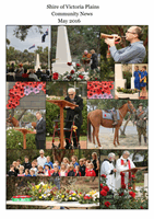
Shire of Victoria Plains
5
Have your say...
Shire Logo Proposals
On the following pages you will see 2 proposed potential new designs for a Shire logo. These are just
some ideas for consideration that have been created by a graphic designer following a brief
submitted by a group of local community representatives. Please understand that some adjustments
may be made to either design if Council choose to proceed, or it may be decided to obtain other
proposals.
If a new design is agreed upon, the changing of stationary and signage will be implemented gradually
with old stocks of stationary being used up before replacements are ordered. So the costs will be
kept minimal.
Why a new Shire Logo?
As many long term residents would know, there has been discussions regarding updating the logo
going on in Council and the community for many years. Various competitions have been run for local
artists to come up with a design, and whilst some have gone to a fantastic effort, nothing was ever
agreed upon by past Council members.
It has now come to a stage where, if the Shire is going to act on this, now is the time to do it. We are
lagging behind in these digital times as we do not have a quality high resolution digital version of the
current logo needed for most publications these days. After consulting with graphic designers and
obtaining several quotes we were informed that to have a “re-draw” of the current logo would
actually prove more expensive than to have a new design created.
It can be said that the current shire logo is quite outdated, but not historically significant having
been created some time in the 1970’s. It is very detailed, and some say “busy”, which makes it
difficult to use on a small scale for items such as stationary, and even on a larger scale on things such
as signs, it is still difficult to make out all the elements, especially if you are driving past.
About the designs:
As a widespread shire, with varied towns and elements the challenge was deciding on a brief which
would represent each town in a simple design that does not end up looking too ‘busy’ like the
current logo. Farming is obvious, but we didn’t want to have the typical wheat and sheep that is in
almost every other Wheatbelt shire logo. The options that the community reps came up with is
representing the 7 towns, with either 7 crops lines (Option A), or 7 stars (Option B) that are placed in
alignment with the location of each town on a map of Victoria Plains. We also have a pretty unique
connection with the night skies and space, with the ESA Space Station and observatories located in
the shire, so the stars are represented in each design. We also thought the space/stars element was
important because it connects with today’s modern farming technology, such as GPS. Other
elements which are important and were conveyed to the designer to incorporate, perhaps through
the use of colour were: New Norcia (olive green for the early olive groves); Moore River (blue);
Canola (gold); early exploration and trails such as the Rabbit Proof Fence and Pilgrim Trail (earthy
brown tones).